top of page
Flip Academy
Gamifying the onboarding experience of a financial literacy education platform.
An industry UI/UX case study.
Flip Academy
Overview
Flip Academy is a virtual educational platform focused on offering middle school through high school students the tools they need to leave education debt-free and financially literate.
Flip & Floss (Parent company) aims to enhance the onboarding experience for new users of the Flip Academy platform by designing a gamified, user-friendly walkthrough. The current onboarding process lacks engagement and interactivity, leading to a steep learning curve for new users.
Objective
Create a entertaining onboarding and tutorial experience that successfully educates children on how to use Flip Academy.
Role: Lead UI/UX Designer (Team of 3 Interns + Designers)
Use Case: Company Impact
Duration: 40 hours
Tools Used:
Figma
Procreate
Sheets
Forms
FigJam
Miro
Docs
Define and Empathize
Current Pain Points
During a short chat with the company, it has been revealed that students:
-
Lack clear instructions on how to navigate the platform
-
Are asking many questions during the onboarding process
-
Lack motivation to complete current tutorials
My Role
As a UI/UX Design Lead, I directed efficient organizational strategies for completing this task within the given 40 hour limit. These duties include but are not limited to:
-
Creating a project plan and delegating team members' tasks by hour
-
Communicating on behalf of the Design team with the developer and important stakeholders
-
Professionally representing Flip & Floss during testing and research sessions

Project Plan
Given a time constraint of 40 hours, work that had been previously accounted for by the Flip Academy team was fetched. This made the "Define" phase of the standard UI/UX strategy streamlined.
After conducting a series of introductory sessions with Flip & Floss project managers, designers, and developer, the following items had been shared from previous projects:
-
Market analysis
-
Personas
-
Style & branding Guides
-
Test results
-
Current onboarding flows
While these items were supplied to help with the project, it was still important for our team to validate these deliverables as relevant to the onboarding project.
After a collaborative analysis session, we concluded that these items can be used to assist in quickly customizing relevant data for this project.
Thus, we would be recreating these items.
Competitor Analysis
To assist with understanding tried and tested successful onboarding ideas, an analysis of similar child education apps was conducted.
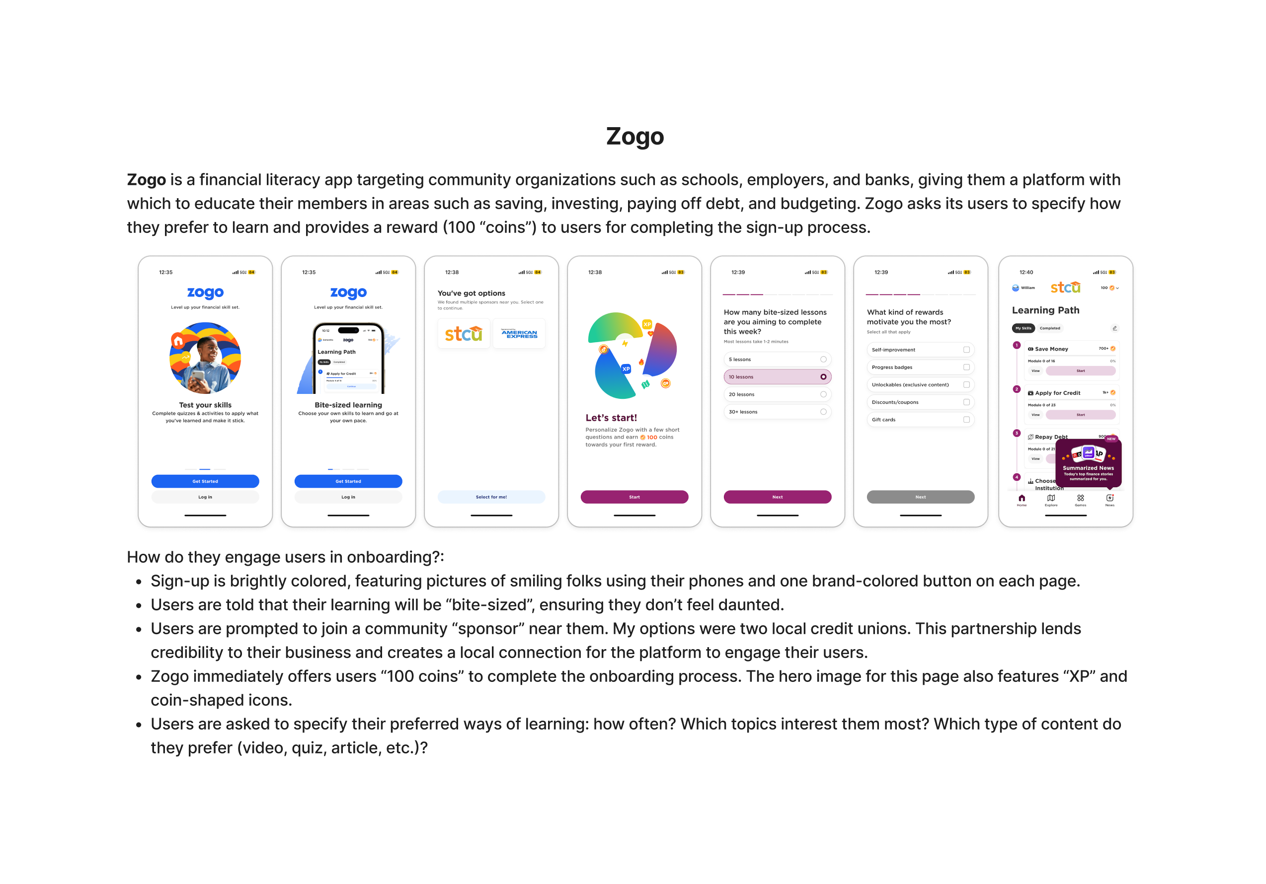
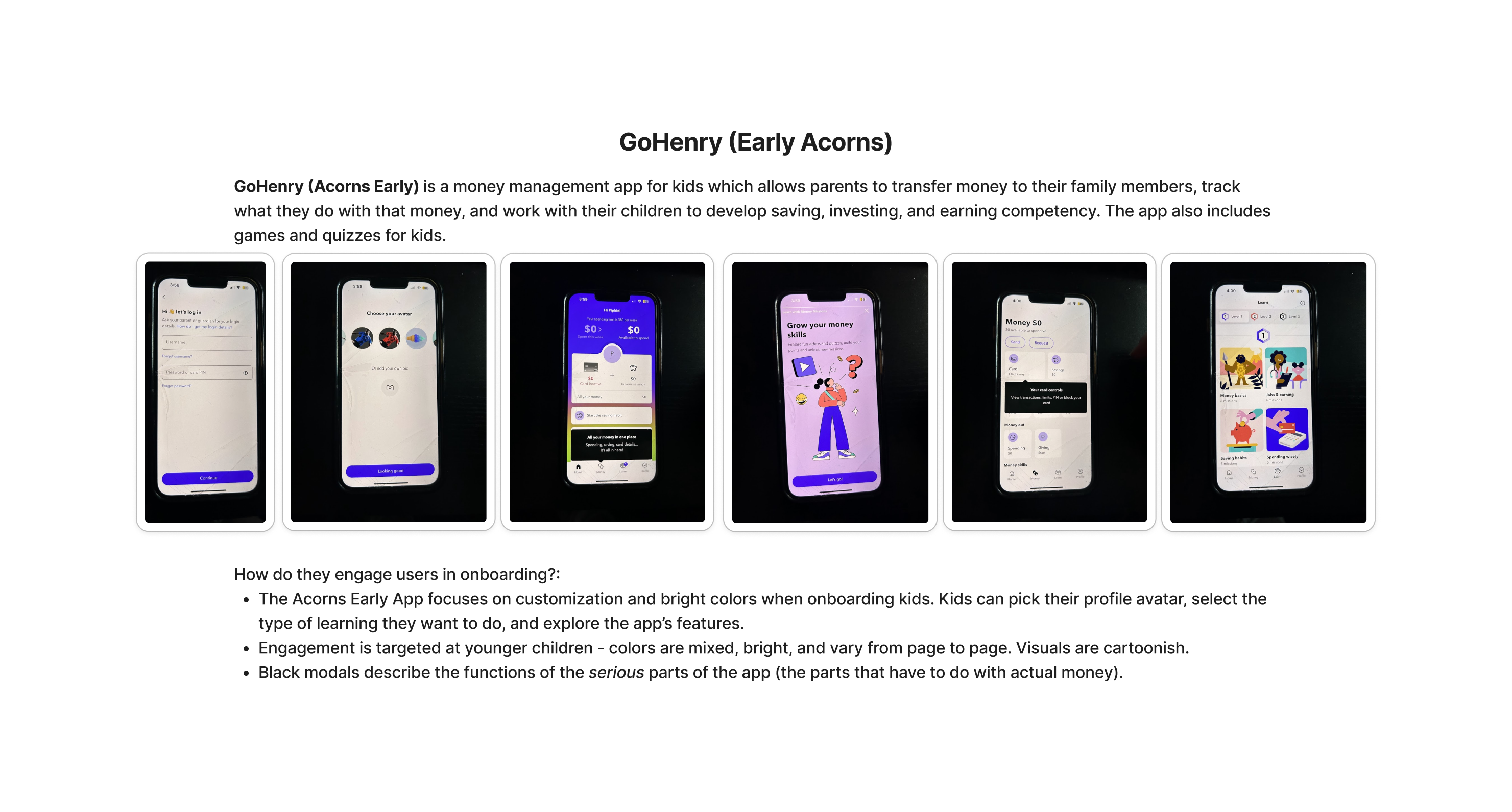
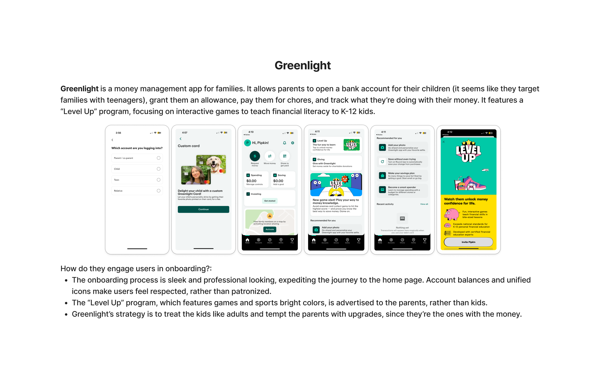
Insights
The insights gathered matched many of the suggestions previous stakeholders are designers found on previous projects. Here are some summarized points:
-
Children are motivated by a points and rewards system along their onboarding journey
-
Common color choices are bright and engaging
-
Professional, clean looking and mature design choices help kids stay focused
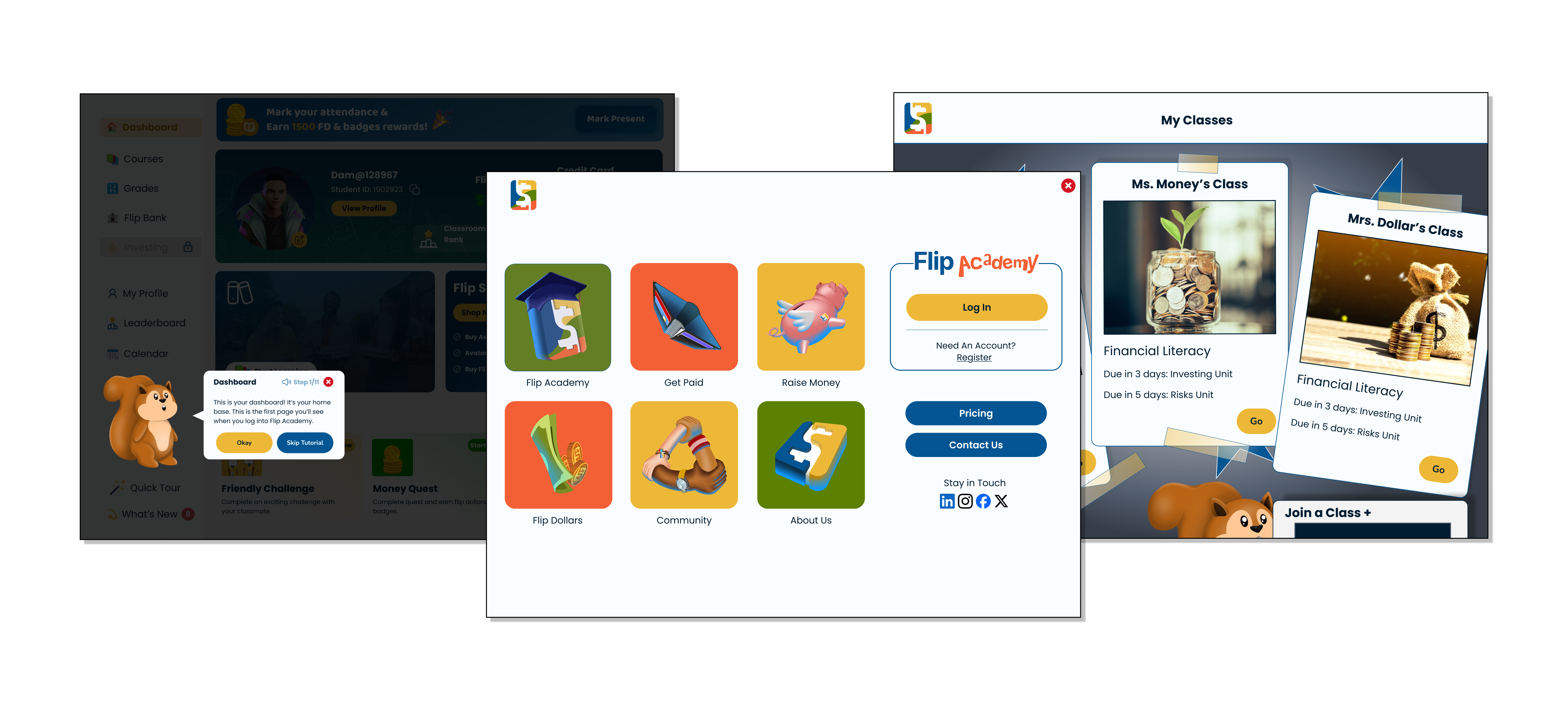
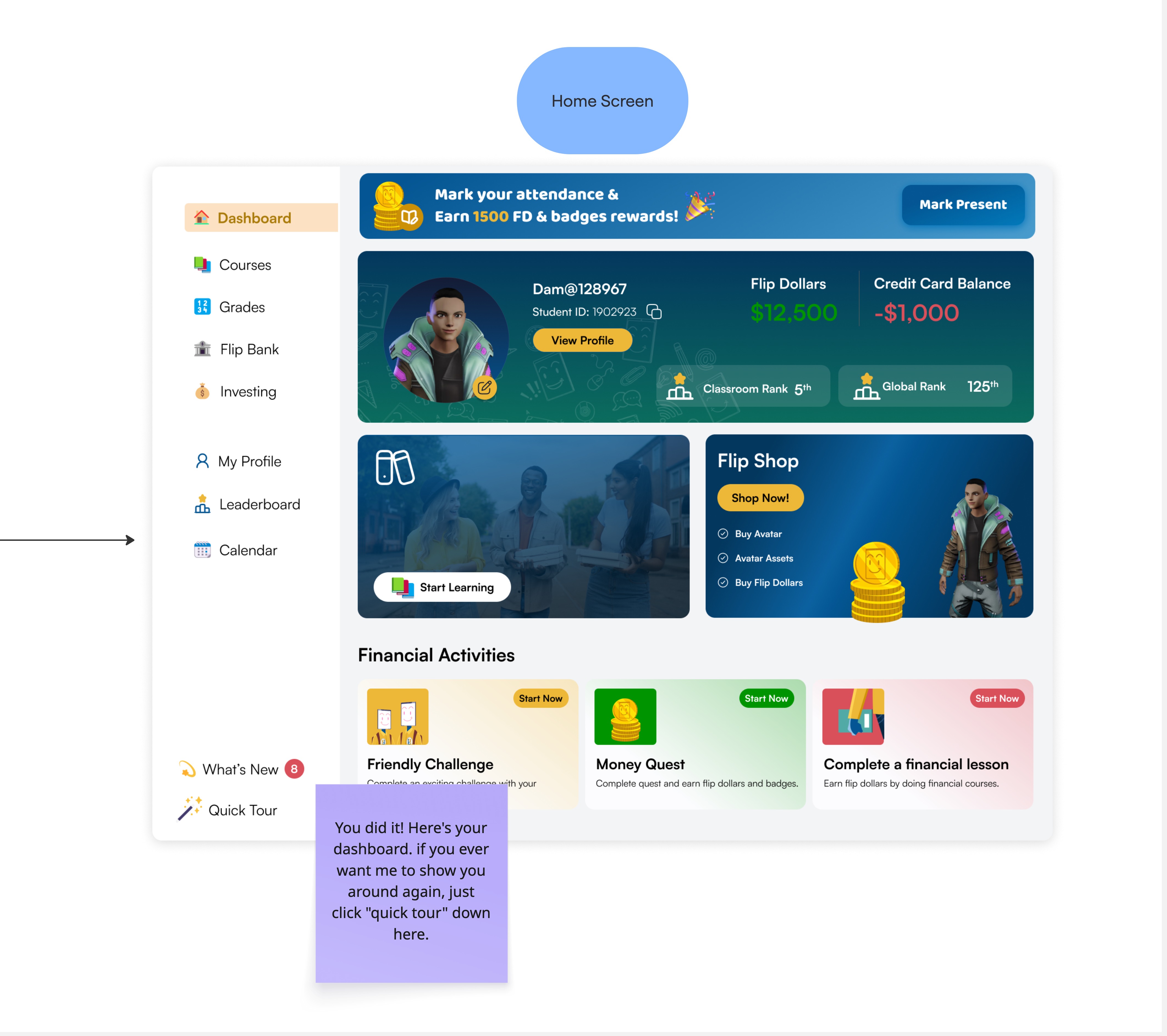
Current Screens
Our team requested to have access to the current state of Flip Academy's onboarding flow. Here are just a few example screens of their product:
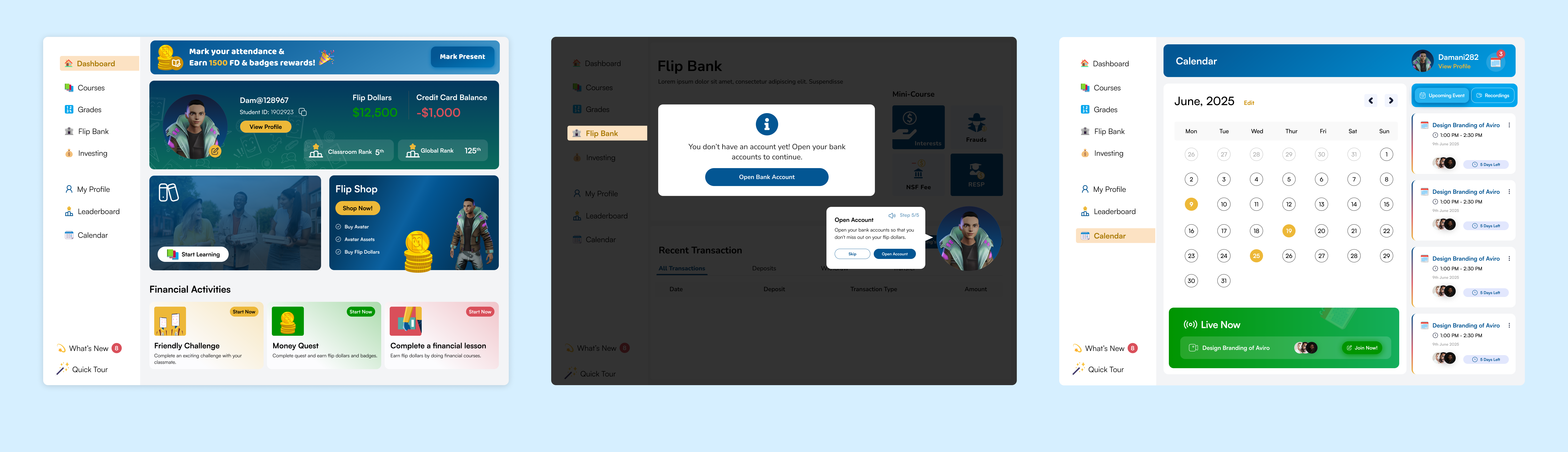
Existing Solutions
Flip Academy's solutions to onboarding feature a character placeholder showing the user around the service in five steps. This character is a placeholder for a customizable avatar that the company wishes to implement shortly.
Flip Academy at this stage is undergoing a complete brand refresh, and these screens are not finalized or tested.
Hurdles
The designs of the current screen solutions generally offer an eye-catching and stimulating experience for children.
However, our team found that there were some concerns with the design choices:
-
There are some WCAG (accessibility) violations in color and readability
-
Inconsistent style protocols - Many variations in font and component size and color variations
-
The design language lacks an intuitive understanding - "Good" Green and "Bad" Red are present but do not sync with the screens' messages
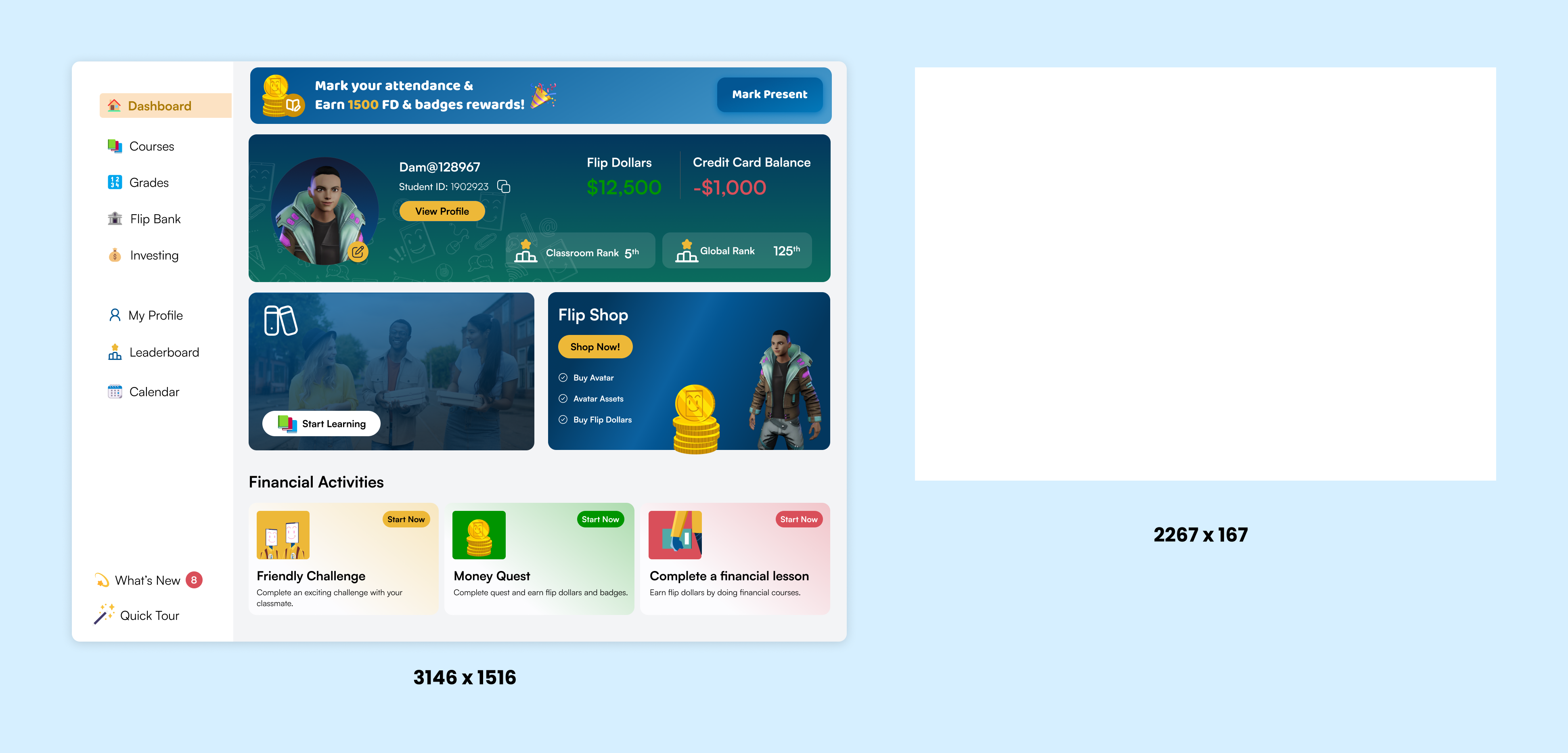
In addition to these concerns, Flip Academy was not designed with a mobile-first strategy and is primarily designed for high definition screens. This means that to view the full screen, users have to scroll or manually zoom out.
Flip Academy's current screens experience difficulty with responsive UI. This is the ideal desktop area size for the common user, especially in a classroom setting:
Time Constraints
With 40 hours of time to complete this project, our team had to assess what was most important -- the requests we were given and the constraints we had.
In addition to these concerns, the company also mentioned that they are preparing for a pilot launch at a couple of schools within the next couple months.
We concluded that we must remain steadfast with the goal at hand of assisting users in understanding the fundamentals of Flip Academy which would remain constant despite future UI changes.
Flip Academy stakeholders also mentioned an interest in pursuing an avatar creator for children to enjoy at the beginning of the onboarding process. I happily offered assistance with this post-project for constraint reasons.
Ideate
Affinity Map
As a team, we analyzed the company's past research and data synthesis (interviews, empathy maps, and personas), and we compared them with our insights on the current market.
While we individually conducted our research, we combined our notes into a brainstorming document. This document was then arranged into a more cohesive map to organize our thoughts.
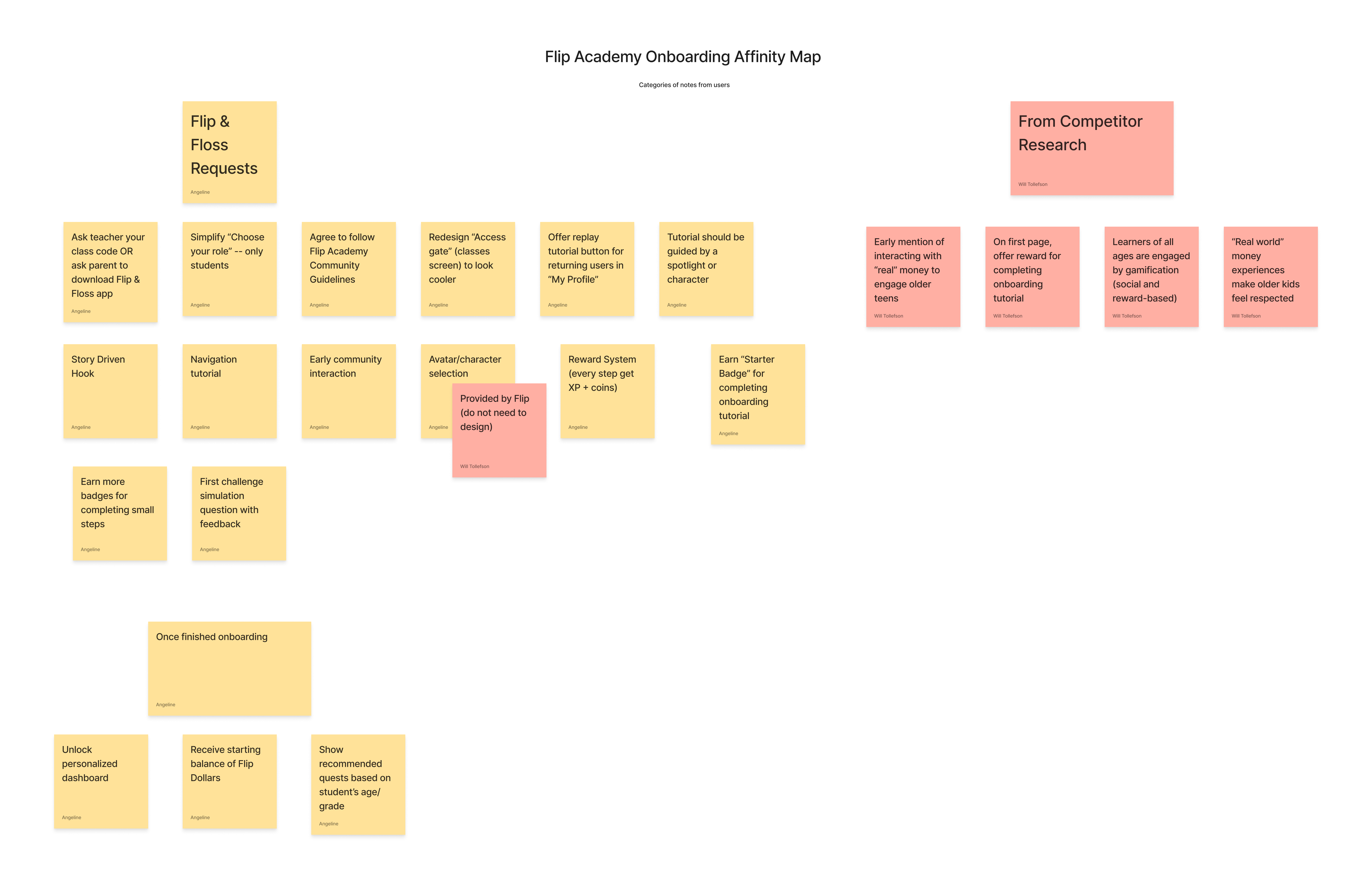
Important Notes
The most important actionable goals we noted were:
-
Providing a clear and concise way for students to log in or register
-
Engaging storytelling
-
Defining Flip Academy language early to help children grasp fundamentals
-
Encouraging a personalized gamified reward experience for the tutorial process
Sketch Flows
A fellow designer on our team compiled the tutorial flow with sketch designs to propose a visual solution for the tutorial process.
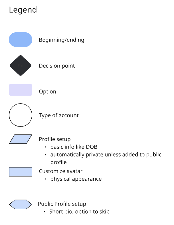
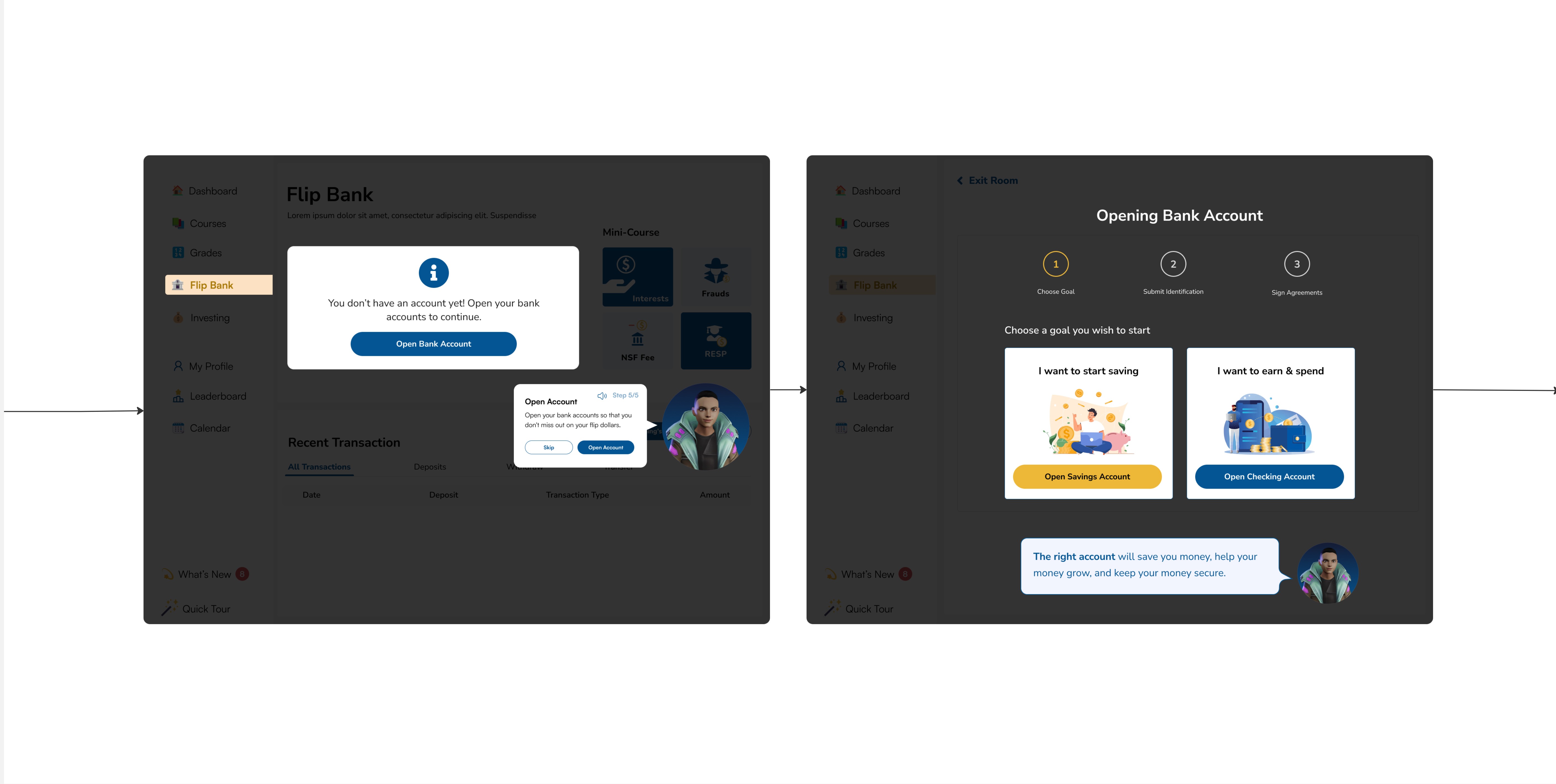
Steps Included
-
The following steps were created at this point in the ideation process:
-
Choose to log in as a student or teacher (Simplified from several staff options)
-
Join a class with a code / Ask your teacher if you need a code
-
Classes will present on a virtual "locker wall" as polaroid photos
-
-
Create an avatar (Placeholder provided)
-
Voluntarily opt in for a multi step tutorial
-
Complete a trial lesson
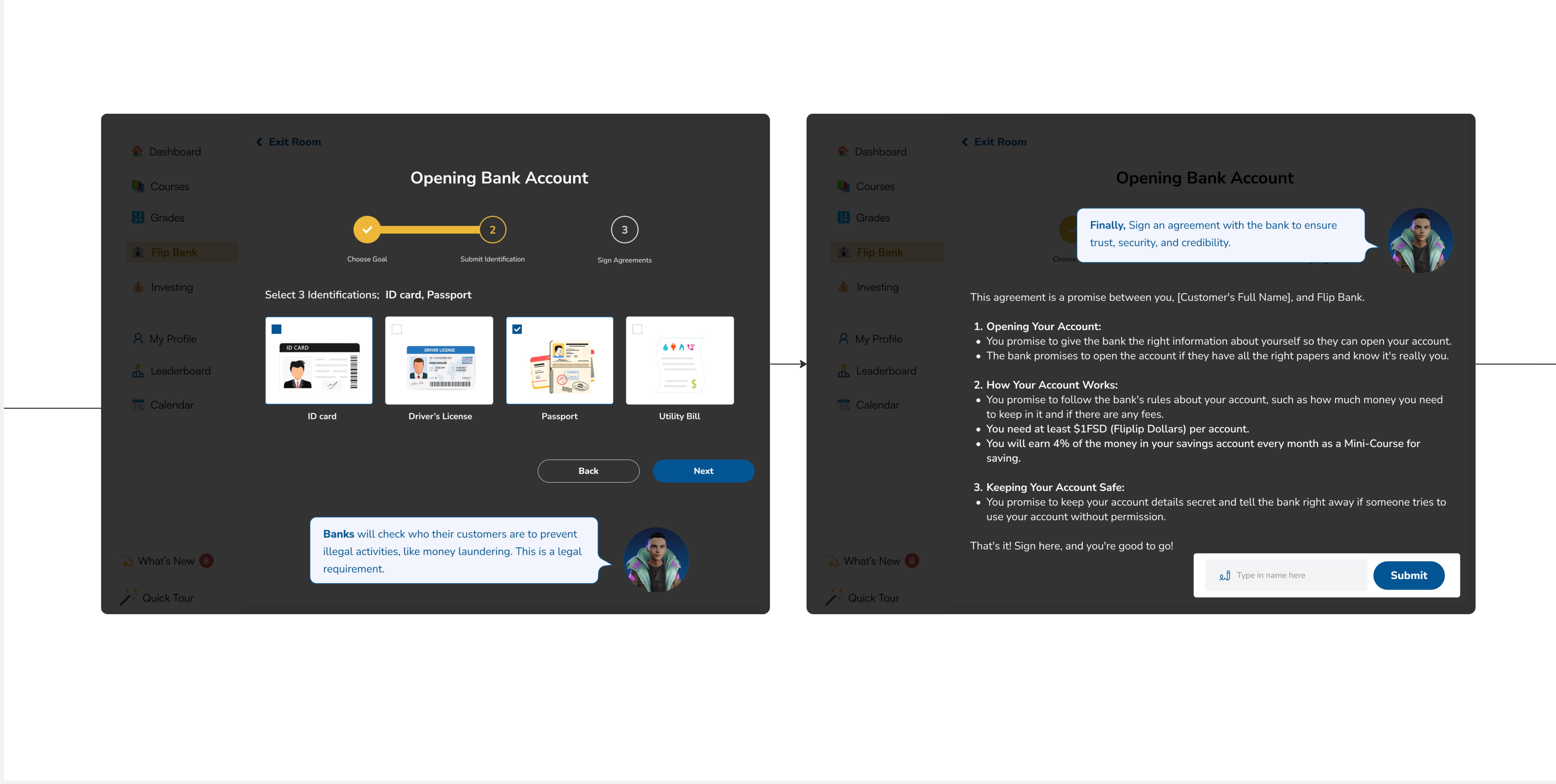
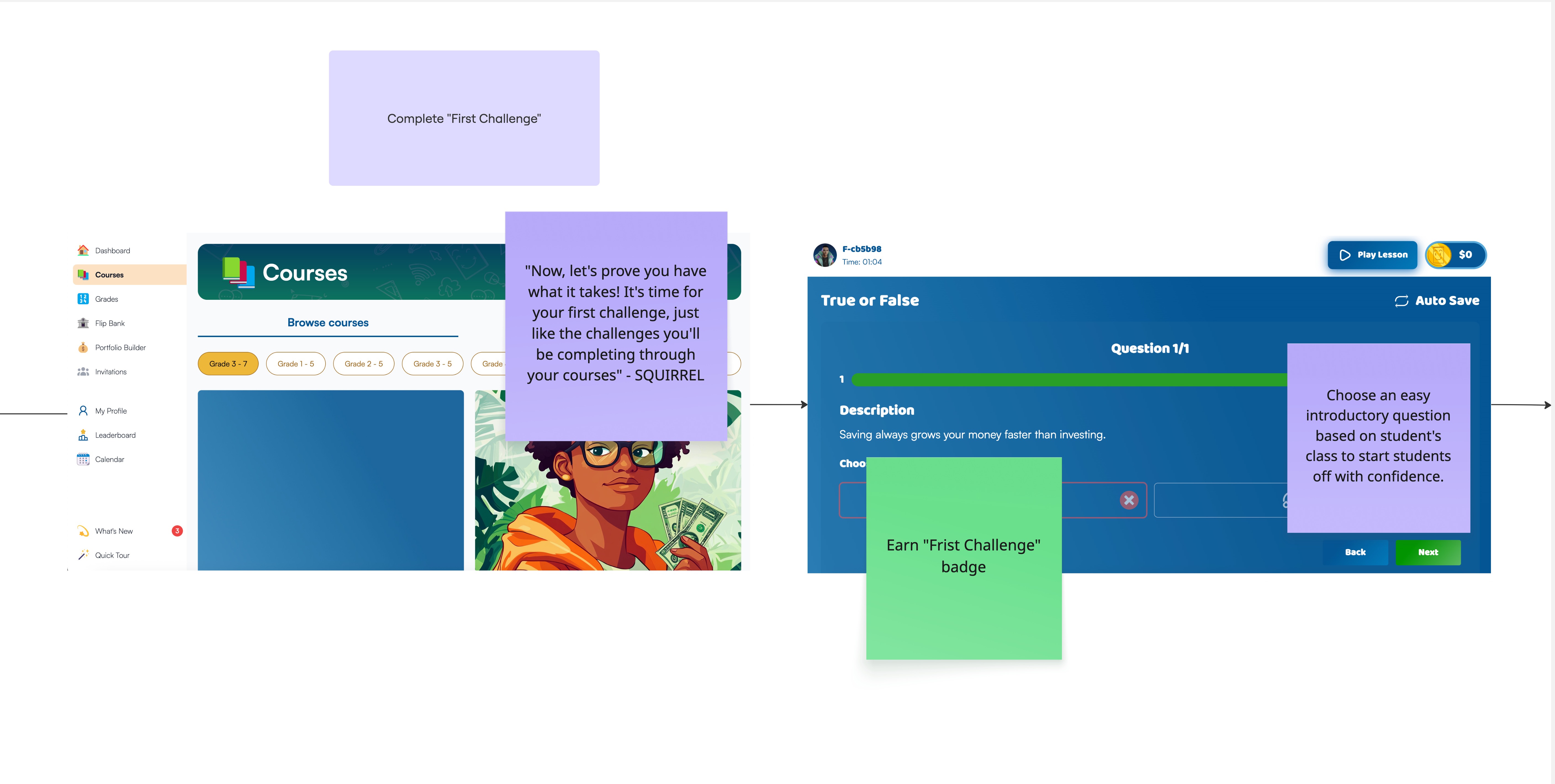
Hi Fidelity Designs
I lead the process of translating low fidelity concepts into hi fidelity designs. The following are just a few preview screens of some design choices:
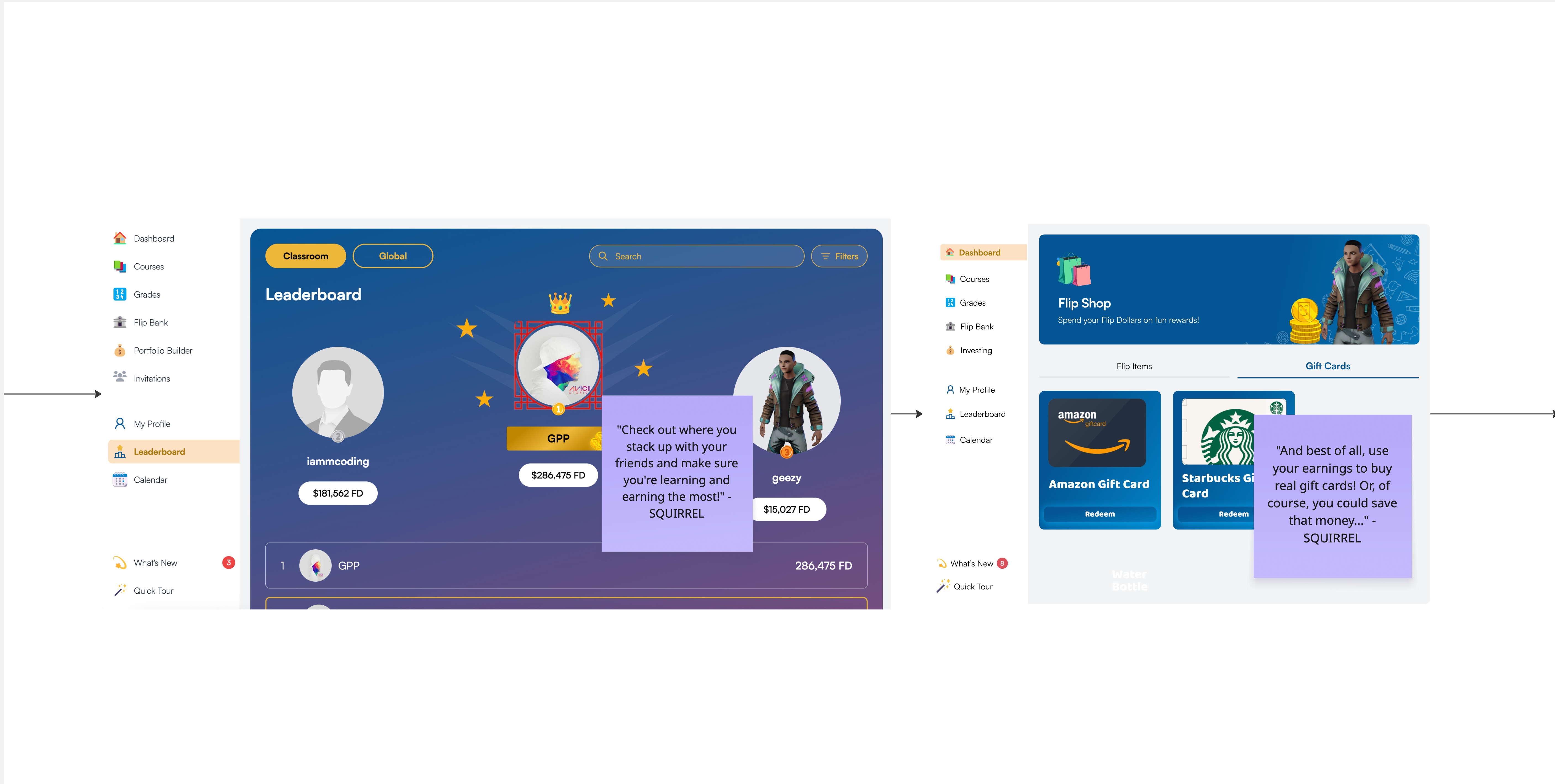
S.Q.U.I.R.R.E.L.
Flip & Floss has a squirrel mascot with the current acronym meaning, "Smart, Quick User Insight Resource for Responsible Earning & Learning.'
The company wishes to expose users to this mascot early as it will become a future AI tool used among its services.
This character has become a guide for users in Flip Academy. Similar to an RPG (role play video game) quest, I have implemented an initial onboarding experience that creates the illusion of talking to him by selecting from dialogue options.
This assists in familiar gamification language and helps young users stay engaged in reading through steps.
Test
Screening
The Flip & Floss business team shared contact information with some users who have previously volunteered to take part in future testing projects. These users received compensation for their time.
Users were elementary through high school aged and present with their guardians during the test.
I decided to run an additional analysis round with the team and consult my senior-level mentor for additional feedback.
Results
It was among my roles to conduct the test and create the test report. The following were the most consistent issues addressed by users and the feedback team.
-
"Join a Class" card is not clearly marked clickable.
-
For the bank account section of the tutorial, users have difficulty with choosing an account. (Clicking "Next" is not a good CTA)
Solution Previews
The following are a preview of screens created after testing and an additional analysis:
Prototype
Final Thoughts
Flip & Floss is a startup at the early stages of its pilot. There is still opportunity for feedback to be gathered and test results used for improving optimization.
Aside from creating the avatar system, there are some things that I personally believe are worth considering:
-
How can we optimize the UI/UX of the Flip Academy product as a whole to shorten the tutorial process and make using it more intuitive?
-
How can we improve the accessibility of Flip Academy?
I have brought to light some areas for improvement with the team for future consideration. Stay tuned for updates


bottom of page